
You are using an out of date browser. It may not display this or other websites correctly.
You should upgrade or use an alternative browser.
You should upgrade or use an alternative browser.
GREY
- Thread startertekgoddess
- Start date
There have been a couple topics like this recently so search. I think you'll find that the most critical thing is the colors used on the set and costumes. Some colors of white paint will never give a good black and white feel no matter how you gel them. Hopefully you have enough time to get some paint chips and test them under light before the set is painted. If not, it's going to be harder to do.
propmonkey
Well-Known Member
ive been told using n/c yellow (ros 06) when the set and costumes are done properly ill provided a nice look that gives the feel of bw. i hate to draw attention away from controlbooth but i know i saw on blueroom there was a discussion of creating a bw film look on stage.
Check this thread. You'll find a fair bit of discussion on this subject there.
waynehoskins
Active Member
"Grey" gel is really only neutral-density: that is, it reduces intensity equally across the spectrum. In theory at least.
Seems like what you'd need to do is essentially light it monochromatically, using intensity to make differences where normally we'd use color.
One guy I worked with some years back talked about having used R98 and R99 as key and fill colors for that effect; but again, if you're lighting a full-color subject, there's unfortunately no magic Chroma-Suck gel. An image orth camera would sure do it, though.")
Seems like what you'd need to do is essentially light it monochromatically, using intensity to make differences where normally we'd use color.
One guy I worked with some years back talked about having used R98 and R99 as key and fill colors for that effect; but again, if you're lighting a full-color subject, there's unfortunately no magic Chroma-Suck gel. An image orth camera would sure do it, though.
waynehoskins
Active Member
Look at R98's transmission graph, it's not equal across the spectrum?
You're right .. I didn't have a swatchbook with me, hence the "in theory" bit. My point was that grey isn't a color of light; it's a generally-even reduction of intensity. 98's pretty flat in the visible range, but it takes a dip around 400-450 nm, in the green-blue range, about where 78 has its peak, so that may seem to make it warm things up; that seems to match what I remember it doing.
quarterfront
Member
Generally, though ND isn't exactly technically perfect across the spectrum, the idea is that it simply reduces the light output of an instrument evenly without changing the color. GAM even names their ND's in stops.
Often I'll use ND for color correction this way: Say I have a scene that I need to light fairly low, with the lamps at about 20%, but I don't like that running them so low is making them go warm on me: I'll pop a couple stops worth of ND into the color frame so that I can run the lamp at, say, 80% but get the intensity of a unit at 20%.
But getting a B&W look, what you need to do is go to a monochrome scheme. Doesn't matter which color monochrome - you can make it all about blue or all about amber or all about pink or all about sepia, or whatever, but if you go monochrome in your lights you'll null out some of the chromatic variation in the set and costumes.
No amount of sticking to monochrome will work without your costume and set designers getting you a good part of the way there, though. They need to go monochrome to start out, then you take that ball and run with it.
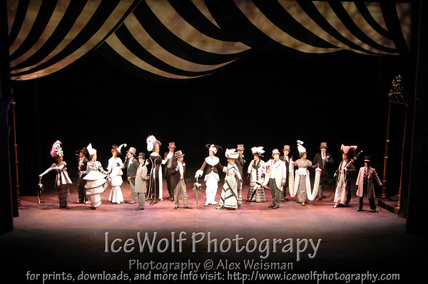
Grey, black & white, what have you, does not have to be solely accomplished through lighting. In fact it is less dependent on lighting and more dependant on the scenery and costumes. Take a look at our current show My Fair Lady. Those of you who know the show know that traditionally the scene at the Ascott races is a "black & white" scene; the women wear big fancy black and white dresses and hats while the mend wear either black and white suits or grey suits. So, look at this photo (for reference, our costumes are black, white, and grey with pink trim):
Who wants to guess as to what colors we have in the lights that are on in this scene? Well, the primary light in this scene is from low sides in R44 (Middle Rose). Frontlight is pretty standard McCandless: amber and blue, however we also have a rose frontlight system in there too. I don't remember what the top /back lights are in for this, but I can almost guarantee you that there are very few, if any, no color lights in the scene.
So, what's my point? Well as you know there is no way to light in black & white. The OP says they need a "Film Noir" look. When you think about how these films were created you will realize that the lighting designer had very little to do with it. B&W film did all the work and unfortunately, we can't just tell our eyes that we want to see B&W for two hours.
You actually can use many different colors of light and still achieve a B&W look on stage. The key is in the costumes and set. Consider that for the most part, the more light you through on stage the whiter it will look because when we (additively) mix all colors of light, we get white. Also, there is a very wide range of colors that can be used to set the "white point" for a show or scene. There are lots of pale to middle lavenders, yellows, blues, ambers, and even a few greens that when used alone will be perceived at white. This allows you shift from say a pale amber to a pale blue and while the eye will still see white it will appear much colder/bluer. Kind of like comparing the white light from an incandescent source to the white from an arc source, it is still white, just very different white.
So sure, you probably don't want to light your cyc with big bold colors if you are looking for a B&W feel, though lighting it with only no color may feel odd. You might try an RGB mix to white as it won't be perfect, but it will get very close and look more interesting. As for the rest of the stage, you can use color and still maintain the B&W feel (as long as scenery and costumes plays along). You will be able to accent and set mood and tone and time of day with lighting, you shouldn't feel boxed into only using pale colors or no color in your units.
And for what it's worth, a great deal of the "film noir" look is about a really strong key and very little fill. It's the shadows that make film noir . . . well . . . noir . . .
Similar threads
- Replies
- 7
- Views
- 870
- Replies
- 13
- Views
- 2K
- Replies
- 6
- Views
- 3K
- Replies
- 6
- Views
- 2K
- Replies
- 2
- Views
- 1K
Users who are viewing this thread
Total: 1 (members: 0, guests: 1)