Light booth paint color?

JLNorthGA

Active Member
While we are "remodeling" our little playhouse - I was thinking about getting a gallon of paint for the light booth.

Our light booth is at the back of the house. During performances only a Littlelite and maybe another small lamp will be on.

What would be a decent color? I won't attempt to describe the current color except to say that it is not to my taste. Should I go with a dark color or a light color? I can see going with a light color to make sure it is not a "cave" - this would have the added benefit of maximizing the available light. I can also see going with a dark color - that way it would be less noticeable if people were looking back at the light booth.
 
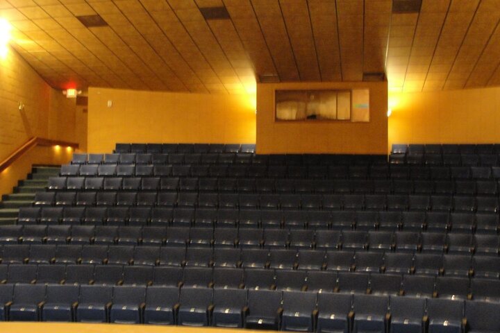
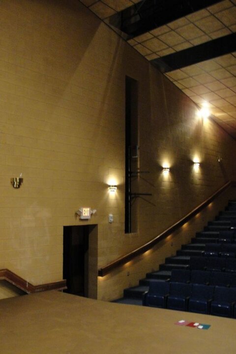
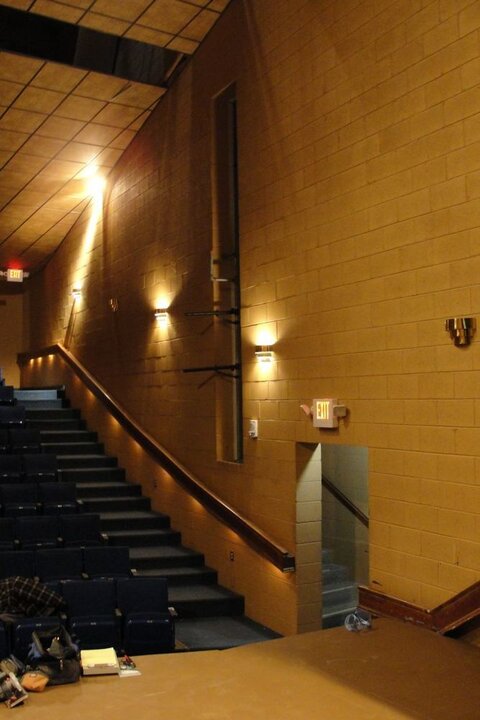
What does the back wall look like? What color is the rest of the house?
 
While we are "remodeling" our little playhouse - I was thinking about getting a gallon of paint for the light booth.

Our light booth is at the back of the house. During performances only a Littlelite and maybe another small lamp will be on.

What would be a decent color? I won't attempt to describe the current color except to say that it is not to my taste. Should I go with a dark color or a light color? I can see going with a light color to make sure it is not a "cave" - this would have the added benefit of maximizing the available light. I can also see going with a dark color - that way it would be less noticeable if people were looking back at the light booth.

I feel the space will dictate. If there is a chance that a white or other lighter color booth will help push light out into the house to a noticeable, therefore unacceptable level, go with black, or dark. If your booth is raised up over the audience seating, say a mezzanine like level, the bleed into the space will be minimized. I know of such booths like this, but really they are more of auditorium size, rather than, smaller black box theatres.
One thing I HATE in a control booth: Tinted Windows!! AARRGGGHHH!
I prefer a room that is not a black or dark color.
 
Last edited:
What does the back wall look like? What color is the rest of the house?

Sort of a peachy/brown color. As they say in the parlance - "baby poo brown".
DSC00995a.jpg
 
Are those mirrored or tinted windows or is that the color of the booth walls?
I'd opt for the same color scheme as the rest of the house, it looks nice to me, as long as the booth lighting doesn't push out into the house & pollute dark scenes.
 
I tend to agree with everybody who says keep it the same color as the house. Although the booth in our theater was painted white and threw a ridiculous amount of light right out into the theater and you could see a box of light on the proscenium and first curtain. We ended up painting it black because the light coming out was too bothersome. The black is also kind of annoying because it makes hit hard to see.
 
I had to deal with a lot of mirror walls on stage in my life.
Therefor I would go with a colour that goes with the design of the venue, maybe a little darker to compensate the desk lights and the light emanating from the console monitors.

Alexander
 
My opinion would be black. Flat, matte, black. Here's why:

*I don't want to be seen. At all. Not even a little. I've had more than one show where the talent wants to do a song in the dark, which means that all of a sudden me and my board light are the brightest thing in the room. This wasn't a big deal when my booth was black, but recently all of the black sound-proofing was torn down, leaving bright white walls. Now when the stage lights come down I stand out like a giant, obnoxious black blob. I don't want the audience wondering who that is sitting up there, I want to be invisible, even when the stage is dark.

*My booth is not a "playhouse." It's a place where I go to do a job. So I don't care about the "feeling" or the "feng shui" of the place, I care what's going to benefit the shows. (See above.) I realize that we spend a lot of time in our booths, and we want to feel comfortable there, but the reality is that if you're more worried about the "taste" or the "feel" of the booth than the audience experience, you need to reconfigure your priorities. You want it to be a comfortable space to be in? Buy a comfy chair. Paint the walls dark.
 
Perhaps consider taking the same colour as the house, but getting it "double strength" (Do you have that in the states?). That will help with the not too light and bright I should expect...

We do Chris. Worked paint for awhile and all you need them to do is shoot the formula in twice and it comes out a nice darker variation of the original


Sent from my iPod touch using Tapatalk
 
My opinion would be black. Flat, matte, black. Here's why:

*I don't want to be seen. At all. Not even a little. I've had more than one show where the talent wants to do a song in the dark, which means that all of a sudden me and my board light are the brightest thing in the room. This wasn't a big deal when my booth was black, but recently all of the black sound-proofing was torn down, leaving bright white walls. Now when the stage lights come down I stand out like a giant, obnoxious black blob. I don't want the audience wondering who that is sitting up there, I want to be invisible, even when the stage is dark.

*My booth is not a "playhouse." It's a place where I go to do a job. So I don't care about the "feeling" or the "feng shui" of the place, I care what's going to benefit the shows. (See above.) I realize that we spend a lot of time in our booths, and we want to feel comfortable there, but the reality is that if you're more worried about the "taste" or the "feel" of the booth than the audience experience, you need to reconfigure your priorities. You want it to be a comfortable space to be in? Buy a comfy chair. Paint the walls dark.

Im a big fan of Flat black on the back wall, flat charcoal grey on the rest. If you really want it to be nice and comfortable, bring in a nice chair, mini fridge, etc. However, in this case, its pretty obvious that its the booth up there, perhaps go in a very dark version of the rest of the space as was mentioned. Its a bit silly in my view to have a giant black blot there. Also, unless Mrs. Footer wears a black shmah to work, her face will still glow in the monitor and board lights anyhow. No avoiding it. Its nice to be invisible, but that is kind of a tall order and looks odd in such a light playhouse...
 
We do Chris. Worked paint for awhile and all you need them to do is shoot the formula in twice and it comes out a nice darker variation of the original

This is true, but YMMV depending on how dark the color is, and how much tint is added. If it's a beige or taupe color, you should expect there to be about 3 ounces of colorant in there, give or take. These usually go in to a light tint base sometimes referred to as a "pastel base", "Ultrawhite", or "Base 1". There will generally be enough room in the top of the can to double the formula.
However, this is where it gets tricky. For a dark or saturated color, like red, black, or deep brown (plus many others), a deep base is required, and up to 12 ounces of colorant may be added to form the needed color. An additional 12 ounces of colorant would overflow the can by a long shot and simply substituting a larger can without adding more tint base would seriously mess with the paint's properties -- colorant never actually dries as it relies on the binders in the tint bases.

A custom-mix black (meaning, one they shoot at the store rather than coming straight from the factory pre-tinted) is simply 12-13oz of Lamp Black (NovoColor Colorants) in a Deep Base or Base 4/Base 5 depending on brand (they all have different terminologies for their tint bases).

I work in the paint department at Lowe's and mix paint/color match all day. And yes, I use the machine (spectrophotometer) to do color matches, but usually only as a starting point. I will generally dispense only half of its recommended formula and do the rest by eye as the machine tends to error on the dark side. It's hard to lighten paint that's too dark, but much easier to dispense the other half of the formula if need be. It's also easy for me to look at the resulting color and say "this needs half a shot of green to get rid of that magenta hue".

Anyway, yes you can generally double-tint, but only if it is a fairly light color to start with.

Les you described to a T what I did working for Lowe's. We were the same way. We'd start low and work from eye after that. It didn't help that not only did the color match usually go dark but the screen we had always showed darker than what it dispensed. We had some good luck matching stuff that was supposed to be in a base one into a base 2 or 4 and that would allow room for some play with the colorants. It certainly doesn't get any worse than yellows though. They are the most difficult to match with accuracy. It can be done but we'd always shoot way less and have to creep up to the color they wanted.


also an offtopic question since I left the company just after Olympic released their "one" product line. How has that turned out, we hadn't heard enough back about it yet to know much about the quality and coverage people were getting.

You are so right about the screen not showing an accurate color. Even though we have LCD's, the color representation on screen always looks way different than the actual finished product. I always find myself having to tell customers "I won't know if it's a good match until I dispense it". Also, somehow they get it in their head that the computer tells me "hey, this is Hopsack". Nope -- it just gives me a recommended formula, and I'll probably have to 'play' with it.

I've found yellow's very difficult as well, and I've also found myself struggling to get a deep gold. Our 107 colorant just isn't quite as deep as I guess some company's colorants are.

Funny you ask about Olympic One, as I have heard mixed opinions about it. I was always under the impression that it was at least as good as the Valspar Ultra Premium, but I had a customer tell me just yesterday that "man, this stuff sucks". Of course, they were covering a burgundy with a light cream color, but I've heard a few similar opinions. I also heard from someone (can't remember if it was directly from a customer or a coworker relaying a customer account) that it was fine when they first used it, but when they went back and reopened it that it didn't work very well the second time around. I'm tempted to buy a quart and do some brush-outs myself. I hate recommending a product that I don't know much about. I want to like the Olympic One - it's at a great price point (Valspar hates that!)

I don't know if you were there for this, but Valspar recently introduced Valspar Plus, which is a step above Signature. It is a hospital-grade paint with zero VOC's and an antimicrobial finish. It sells for over $40 a gallon (and they've bumped the price down a few times). We don't sell much of that.

PM me if you want to share any more paint tips! And sorry everyone for the slightly OT. Hey at least you know that some employees at the big box stores DO care about what they do! :)

Oh, and thanks for the tip on using a base 2 or 4 for colormatches. I hadn't thought of that!
 
Last edited:
Yeah I had the new valspar for about 2 months and we never sold any of it.


Sent from my iPod touch using Tapatalk
 
Yeah I had the new valspar for about 2 months and we never sold any of it.


Sent from my iPod touch using Tapatalk

Market it as scene paint. People seem to be willing to pay overpriced for that stuff...
 
HA! It's got it's advantages because it's 0 VOC and like Les said, hospital grade. It's great for pregnant women with allergies, babies rooms, etc, stuff where you'd want a little more caution. But when you could special order that kind of stuff to begin with, actually stocking it in stores is pointless. We gave it 6 months before they either marked it way down or stopped stocking it entirely. Les mentioned it's at $40 I think when we first got it, it ran around $60 for a gallon.
 
My opinion would be black. Flat, matte, black. Here's why:

*I don't want to be seen. At all. Not even a little. I've had more than one show where the talent wants to do a song in the dark, which means that all of a sudden me and my board light are the brightest thing in the room. This wasn't a big deal when my booth was black, but recently all of the black sound-proofing was torn down, leaving bright white walls. Now when the stage lights come down I stand out like a giant, obnoxious black blob. I don't want the audience wondering who that is sitting up there, I want to be invisible, even when the stage is dark.

*My booth is not a "playhouse." It's a place where I go to do a job. So I don't care about the "feeling" or the "feng shui" of the place, I care what's going to benefit the shows. (See above.) I realize that we spend a lot of time in our booths, and we want to feel comfortable there, but the reality is that if you're more worried about the "taste" or the "feel" of the booth than the audience experience, you need to reconfigure your priorities. You want it to be a comfortable space to be in? Buy a comfy chair. Paint the walls dark.

Absolute, total agreement. Thank you!
 

Users who are viewing this thread

Back