Working on that. After we went like, I started checking the site on other devices. My primary monitor has pretty clear separation, but it's a pretty nice 24" Dell. I'm looking at increasing the contrast between background elements more or putting in brighter borders.
You are using an out of date browser. It may not display this or other websites correctly.
You should upgrade or use an alternative browser.
You should upgrade or use an alternative browser.
Welcome to ControlBooth 5.0
- Thread starterdvsDave
- Start date
BillConnerFASTC
Well-Known Member
Different. It's the "new posts" link that gets me to all the threads with posts I haven't read. Use to be at top of every thread.The update to the site basically wiped out your read/unread history, as far as new posts goes. It kept the basic read/ unread threads history but lost the "read up to X post" history. From here out, once you read a thread, and then there are new posts, clicking the thread title will bring you straight to the first unread post.
@dvsDave:
View attachment 18723
Secondarily, the process to insert that image as an upload is a bit weird, too; Chrome/Mac
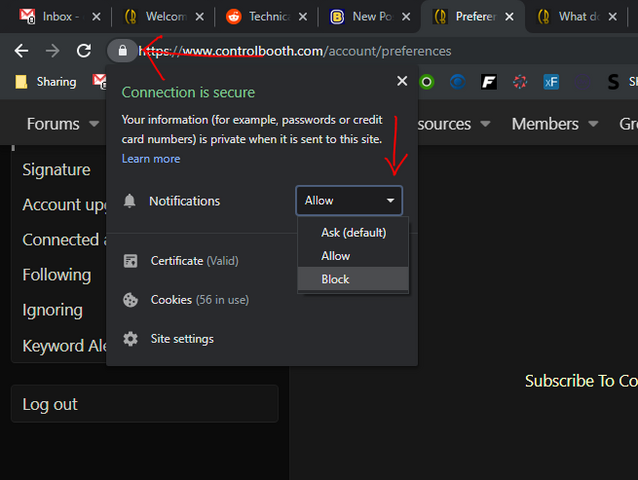
Okay, if you are on Chrome, you can permanently block them by going to the padlock icon on the address bar, clicking it and then choose Block.
As far as how you inserted the image, what method did you use? Copy and paste, drag and drop, the Insert Image button on the toolbar, or the Attach files button?
Different. It's the "new posts" link that gets me to all the threads with posts I haven't read. Use to be at top of every thread.
It still is at the top, no matter how much you scroll. When you are all the way at the top, the secondary menu is visible, when you scroll down, it compacts itself into the main navigation. But unlike the old site, the main navigation menu is "sticky" to the top of the screen.

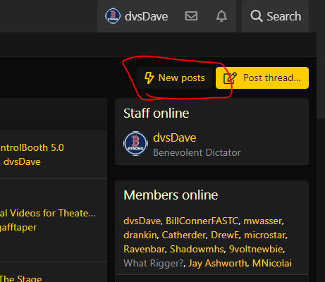
There's also a shortcut button at the top right of the main homepage
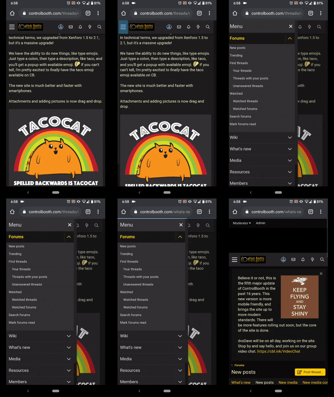
And you can do it on mobile from the "hamburger" menu at the top left.
Last edited:
BillConnerFASTC
Well-Known Member
I swear it didn't use to be under forums - just at top of every thread. On click rather than 2.It still is at the top, no matter how much you scroll. When you are all the way at the top, the secondary menu is visible, when you scroll down, it compacts itself into the main navigation. But unlike the old site, the main navigation menu is "sticky" to the top of the screen.
View attachment 18725
There's also a shortcut button at the top right of the main homepage
View attachment 18726
BillConnerFASTC
Well-Known Member
Ok - so finally had time between flights to take out laptop and its fine there - "new posts" upper right top of thread.
BUT on phone and tablet both, it's not displayed at top of thread and I swear it use to be. Click on the 3 horizontal bars ("hamburger"?) and scroll once and it's there, but nowhere as easy as it was. I'd much rather have the "new posts" at top of thread than the envelope, bell, or lightning bolt.
And of course the "believe it or not" banner just about fills my phone screen displacing all but a thread or two but I assume it will go away after a while.
Still exploring other differences. Lo0ok good otherwise. And maybe if I was a little more app literate I could customize my views, but not going to happen and too old to have another teenager in the house to do it for me.
Got it! Spend the last hour tracking down what was overriding the bolding of the unread threads. At some point, I set the site links to be the correct color, but I must have set the font-weight as normal. Because it was set at the top level, the override to make it bold wasn't high enough in the DOM to override the primary setting. As soon as I removed the font-weight option from the sitewide links, that fixed it.
It’s working, thanks.
However at least on mobile I wish the bold was even bolder. It’s not a easy to tell the difference as the old font. Ok desktop the difference appears more pronounced
Philip
It’s working, thanks.
However at least on mobile I wish the bold was even bolder. It’s not a easy to tell the difference as the old font. Ok desktop the difference appears more pronounced
Philip
I'm working on a a way to set the font weight even higher on mobile view only. It's too bold on the desktop if I go to the next font weight up.
Amiers
Renting to Corporate One Fixture at a Time.
@dvsDave Bill is correct there used to be a floating Nav with new post words as well as the lighting bolt.Ok - so finally had time between flights to take out laptop and its fine there - "new posts" upper right top of thread.
BUT on phone and tablet both, it's not displayed at top of thread and I swear it use to be. Click on the 3 horizontal bars ("hamburger"?) and scroll once and it's there, but nowhere as easy as it was. I'd much rather have the "new posts" at top of thread than the envelope, bell, or lightning bolt.
And of course the "believe it or not" banner just about fills my phone screen displacing all but a thread or two but I assume it will go away after a while.
Still exploring other differences. Lo0ok good otherwise. And maybe if I was a little more app literate I could customize my views, but not going to happen and too old to have another teenager in the house to do it for me.
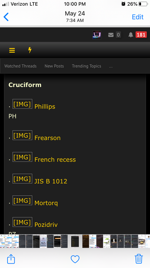
a screen shot from May.
@dvsDave Bill is correct there used to be a floating Nav with new post words as well as the lighting bolt.
View attachment 18757
a screen shot from May.
You were using the CB pro theme, which was never the default theme. But, I am working on a fix to make the current lightning bolt default to New Posts instead of Latest Posts. The templating logic is very different in this version than it was in the old version. Much easier to maintain, but harder to wrap my head around.
I always forget I use the old ball theme.
I’m surprised there isn’t an importer of pervious themes and that it’s a complete overhaul. Talking about a kick in the pants.
The whole templating system is completely different, but they did make an attempt to interpret the colors scheme when you upgrade. The results weren't... pretty.
It also was quite yellow-on-yellow-on-yellow here, very hard to read without selecting the text.It asked if I wanted push, and when I said no, it said "are you sure? It's really really handy" or something akin in tone to that.
Plus it had a problem with z-stacking and opacity in the second message, making it hard to see the
"Yes -- Later -- Nosirree"
option choices.
Jay Ashworth
Well-Known Member
I've just learned, @dvsDave, that the new code will allow you to type more than one space before a new sentence, but will not *display them*. They're there, you have to backspace over all of them to get rid of them, but it declines to display them. UPDATE: No, it's *any* collection of multiple spaces.
Discarding the "display what I damn tell you", and "two spaces after a period is not only just fine, it's recommended for legibility" arguments... this also impacts the functionality of ASCII art drawings, which are occasionally useful in forum environs like this.
Oh, and also the "don't store them but not display them, that's evil" argument.
Is there a global system toggle for "compress multiple spaces"? Can you -- and would you -- turn it off?
I've just learned, @dvsDave, that the new code will allow you to type more than one space before a new sentence, but will not *display them*. They're there, you have to backspace over all of them to get rid of them, but it declines to display them. UPDATE: No, it's *any* collection of multiple spaces.
Discarding the "display what I damn tell you", and "two spaces after a period is not only just fine, it's recommended for legibility" arguments... this also impacts the functionality of ASCII art drawings, which are occasionally useful in forum environs like this.
Oh, and also the "don't store them but not display them, that's evil" argument.
Is there a global system toggle for "compress multiple spaces"? Can you -- and would you -- turn it off?
Ummm... Huh... That's a new one. I hadn't realized that was a thing! I'll look into it.
Discarding the "display what I damn tell you", and "two spaces after a period is not only just fine, it's recommended for legibility" arguments... this also impacts the functionality of ASCII art drawings, which are occasionally useful in forum environs like this.
So, I checked on the forums for the XenForo software and there does not appear to be a way to turn this off. I thought there might be a way to do it with an inline code block, but that doesn't work. I'll be bringing this up as a suggestion with the devs.
Similar threads
- Replies
- 4
- Views
- 1K
- Replies
- 0
- Views
- 683
- Replies
- 0
- Views
- 884
- Replies
- 1
- Views
- 1K
Users who are viewing this thread
Total: 1 (members: 0, guests: 1)


