Need input on how to light this...

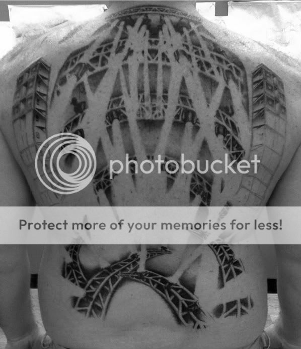
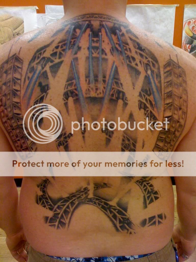
It's been a very long time since I have posted here, so hi all! As you can see in the picture below I am in the process of getting a rather unique tattoo. Obviously it's not complete, I actually have a long way to go before it's finished...but it's getting there. I am to the point now where color is ready to be added to the beams of light. So I am wondering what kind of input I might get from my fellow lighting techs and gurus. I would like to use the following colors...red and yellow as the primary, magenta, blue, purple as secondary. I'm confident that those colors will work together nicely. But if anyone has other ideas I am open, I will probably print out a few copies of this pic and use colored pencils to see what combo looks best, as I only have one shot at it once the needle hits the skin. So what do you folks think....?

P.S....yup, I'm still doing the t-shirt thing....roadierags.com

proxy.php
 
All I can say is it looks amazing. I cant wait to see it finished. Kinda makes me want another one now. Theres a little fear in saying try this color red and it being ALL wrong.
 
It hurts my mind to think about! I am sure it was hard enough to decide between JBL and Meyer!

Do you want any gobo type looks?

Its your canvas man.... props to ya!
 
Theres a little fear in saying try this color red and it being ALL wrong.

That is why mine is still unfilled, originally I was going to have red, gold, and brown portions, but I have not been confident enough to pick a color I'm willing to live with just in case it does look wrong.
 
It hurts my mind to think about! I am sure it was hard enough to decide between JBL and Meyer!

Do you want any gobo type looks?

Its your canvas man.... props to ya!

Actually it was an easy decision, the JBL stack has more details in their cabinets, which makes for a better looking image tattooed, rather than having a black rectangle. I'd love to do gobos, but it'd be had to make them out with everything else going on in the image.
 
That is why mine is still unfilled, originally I was going to have red, gold, and brown portions, but I have not been confident enough to pick a color I'm willing to live with just in case it does look wrong.

I'm interested to see yours, mind posting a pic?
 
I am personally a huge fan of either blue/amber looks, or blue/5500k looks personally. I also like purple, maybe blue and purple?
 
RoadieRags said:
I'm interested to see yours, mind posting a pic?


I should note that it is not as awesome as yours being that mine is a flag, and not a full rig, nor is mine theatre related for that matter. But if you're still interested I'll put up a picture.

It's interesting actually that the color details on mine would be small enough where no one would notice if they didn't look right, but knowing that it wasn't how I thought it would look is my biggest problem. We did fill mine in with sharpies a few times to get rough ideas on color and how it might turn out, but you can only get so close that way. Also thought about starting in with lighter ink then gradually going darker until it was at the right point, another problematic solution.

Sent from my iPhone using Tapatalk
 
If it was me, I would make sure to include some Congo Blue and some nice greens, but you may want to first find out if different ink pigments hold their saturation better as time goes on. I think you want to be especially careful with the type of ink they use so that you know the colors won't be faded in 20 years. On the other hand, it's probably not too difficult for them to go over it again and resaturate the colors should they fade.
 
In my personal opinion, I think you should leave it like it is, with no colors at all. Because now, you're a living breathing coloring book. You can invite friends over to color your back in! Crack some beers, toss a couple packs of Crayola markers, and invite that hot blonde from the bar to help you "decide what colors would look good."

You're welcome.

Though is sounds like a fun idea, I will be getting color. There is yet so much to be done on it, but I am pretty sure red and yellow will be prominent. I just can't figure what else to use. My line of thought on it is very hot color temp from the top, and maybe cooler color temps coming from the bottom.
 
I can see the look on the tattoo artist's face when you say that you want R121...


Reminds me of what my friend said in class the other day:

Teacher: "Does any one know what Yellow is?"
Friend:"#FFFF00"
 
In my personal opinion, I think you should leave it like it is, with no colors at all. Because now, you're a living breathing coloring book. You can invite friends over to color your back in! Crack some beers, toss a couple packs of Crayola markers, and invite that hot blonde from the bar to help you "decide what colors would look good."

You're welcome.

All the encouragement I need to get a similar tattoo... ;-)
 
Well I finally have some color showing up now, the artist and I decided to go with cooler color temps from the top and hot temps coming up from the bottom. Line arrays are finished, at least the black shading is...we also have the beginning of the rigging for them.

proxy.php
 
That looks AMAZING!

I'm reluctant to suggest colors as well. I go through different feelings on colors, and my final thought is always "try it out - it'll only be up for a few weeks." You, however, have a slightly longer show run.

I like the blue and the idea of cool from the top / warm from the bottom. It's also going to be interesting because saturated colors (which we all love in our rock n' roll lighting) look quite a bit different in pigment.

When in doubt, steal from nature. Sunset colors blue / purple / magenta coming down, and sunrise red / orange / gold coming up.

I'd stay away from green or yellow knowing what it does to skin tones... in your case, quite literally... although that may be different depending on what your ink looks like.

Now, the real question... is this tattoo meant to be viewed in 3200K or 5600K? :D
 
Do you have PhotoShop? I would take this pic and make some screen layers, that you can adjust to get the look you want, and to experiment with color.
I can set up the file for you if you like.
Tim
 
I can see the look on the tattoo artist's face when you say that you want R121...

"That's a blue diffusion!" She'd say, startled by the impossibility of your suggestion.

I'd suggest you get some Skelton Exotic Sangria (R39) in there.
 

Users who are viewing this thread

Back